
A smarter way to scale improvement expertise, reduce administrative burden, and support more confident improvement decisions across healthcare...
Charting has always been at the heart of improvement work in Life QI - helping teams understand variation, track progress over time, and measure the impact of change.
Over the years, one message has consistently come through from our customer community: you wanted charting to be more flexible, more configurable, easier to present, and better suited to the realities of day-to-day improvement work.
With Simana, we’ve completely rebuilt our charting capabilities from the ground up.
The result is a significantly more powerful and intuitive charting experience - designed to help teams create clearer visualisations, gain faster insights, reduce manual work, and communicate improvement more effectively across organisations.
Whether you are building SPC charts for frontline improvement projects, presenting performance data to leadership teams, or analysing variation across multiple services, the new charting experience in Simana gives you far greater control over how your data is displayed, interpreted, and shared.
This upgrade includes major enhancements to existing Run and SPC charts, alongside the introduction of a wide range of additional chart types and configuration options.
You can now:
- Set the axis range
- Edit labels and sizes
- Add goal lines
- Ghost data points
- Add on-chart annotations
- Colour-code the lines/series
- Export in a variety of different formats
- Configure your data tables
- Configure data collection schedules
- Aggregate data in multiple ways
- Display charts in small-multiple displays
Let’s walk through some of the headline upgrades (or jump straight to the walkthrough video) …
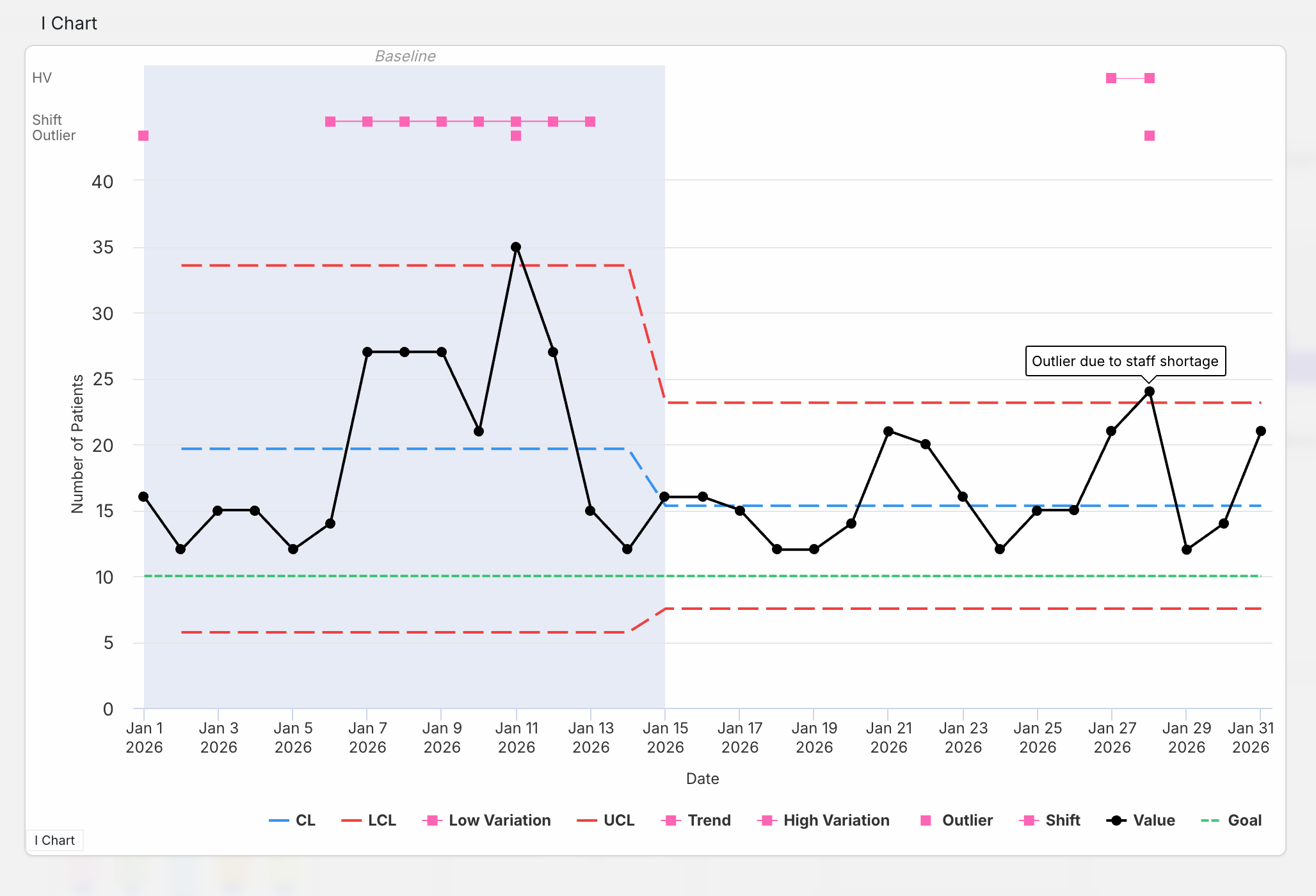
Goal lines
The much-requested goal lines are here! Perhaps you have a defined target as part of your project aim – you can now add that to your chart to get a quick visualisation of how you are progressing toward that aim!
This comes with the option for multiple goals and configuration options such as separate colours for each goal. Goals can also change across the timeline of the charts to represent adjustments or cumulative goals across the full period of data collection.
The new goals feature allows you to visualise the direction of improvement on the chart and progress being made towards realising that goal.
Check out the green goal line in the chart above.
Colour-coding
To improve the legibility of the charts the control limits are now coloured, helping them stand out from the data line and be more immediately recognisable. The control limits have default colours (blue centre line, red upper and lower control limits) but you have the option to change these colours to align with your presentation preferences or organisational branding.
Axis labels and font size
Another much requested feature is the option to change the name of the chart axis. Good news – now you can! Within the chart menu you have the option to rename the labels, set the fonts size and even pick the colour.
Setting axis range
You can now set the minimum and maximum values for the axis on your charts.
Ghosting
Imagine that you’ve compiled your baseline data, but you have some ‘outliers’ which are not truly representative of the state of the measure. Outliers lie outside the realm of Common Cause Variation (natural variation in the system) and are representative of Special Causes. Best practice dictates that these special causes should be excluded from the calculation of your Centre Line and Control Limits within your baseline phase. That’s where data Ghosting comes in.
Our new Ghosting function allows you to leave your data visible on the chart but exclude the selected data from the calculation of the median (in the case of run charts), mean (in the case of control charts), and any control limits. It’s all done with the click of a button.
Small multiples
A small multiples chart display presents a series of similar charts side-by-side using the same scale and format, making it easy to compare patterns, trends, or performance across different sites/teams.
Small multiples displays are now available in Simana, enabling teams to explore and compare improvement data across projects, measures, services, or locations in a much more intuitive and insightful way.
Also possible is the option to combine data lines onto one chart allowing overlays for comparison of multiple sites/teams' data at once.
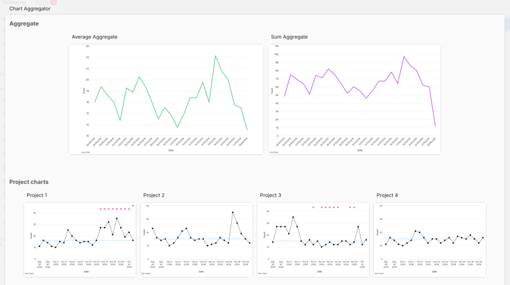
Multiple types of aggregation
We have expanded the types of aggregation available to include: sum, median, mean, and count. The image above shows an example of project charts that have been aggregated using the mean aggregation (left chart) and the sum aggregation (right chart).
On-chart annotations
The annotations you add to specific data points will now display on the chart, allowing them to be read without having to click on the Note icon. The annotations will also appear on the chart exports.
Toggle on/off control limits and special cause types
The new chart configuration options will allow you to toggle the lines shown on the chart on and off. This is useful if you want to focus the viewer on a particular aspect of the data and remove the elements not required in your presentation of the data. This even applies to hiding the actual data line.
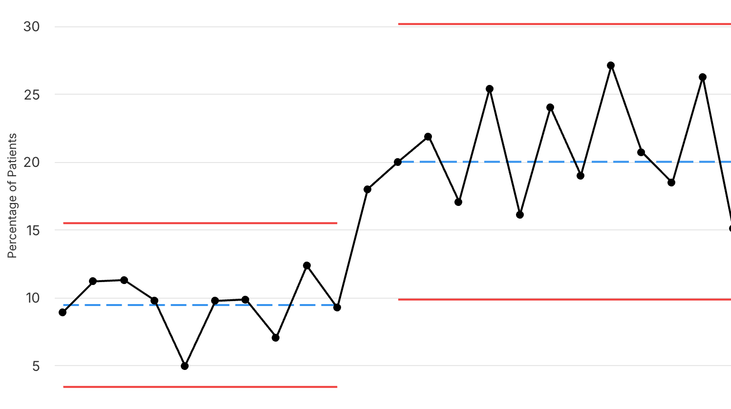
Simpler process breaks
A simple click on the relevant row in the Process break column of the data sheet and the chart will instigate a process break and re-calculate the control limits from that point forwards.
So many amazing updates! Now let’s see them in action in this quick walkthrough video of some of the new chart features…
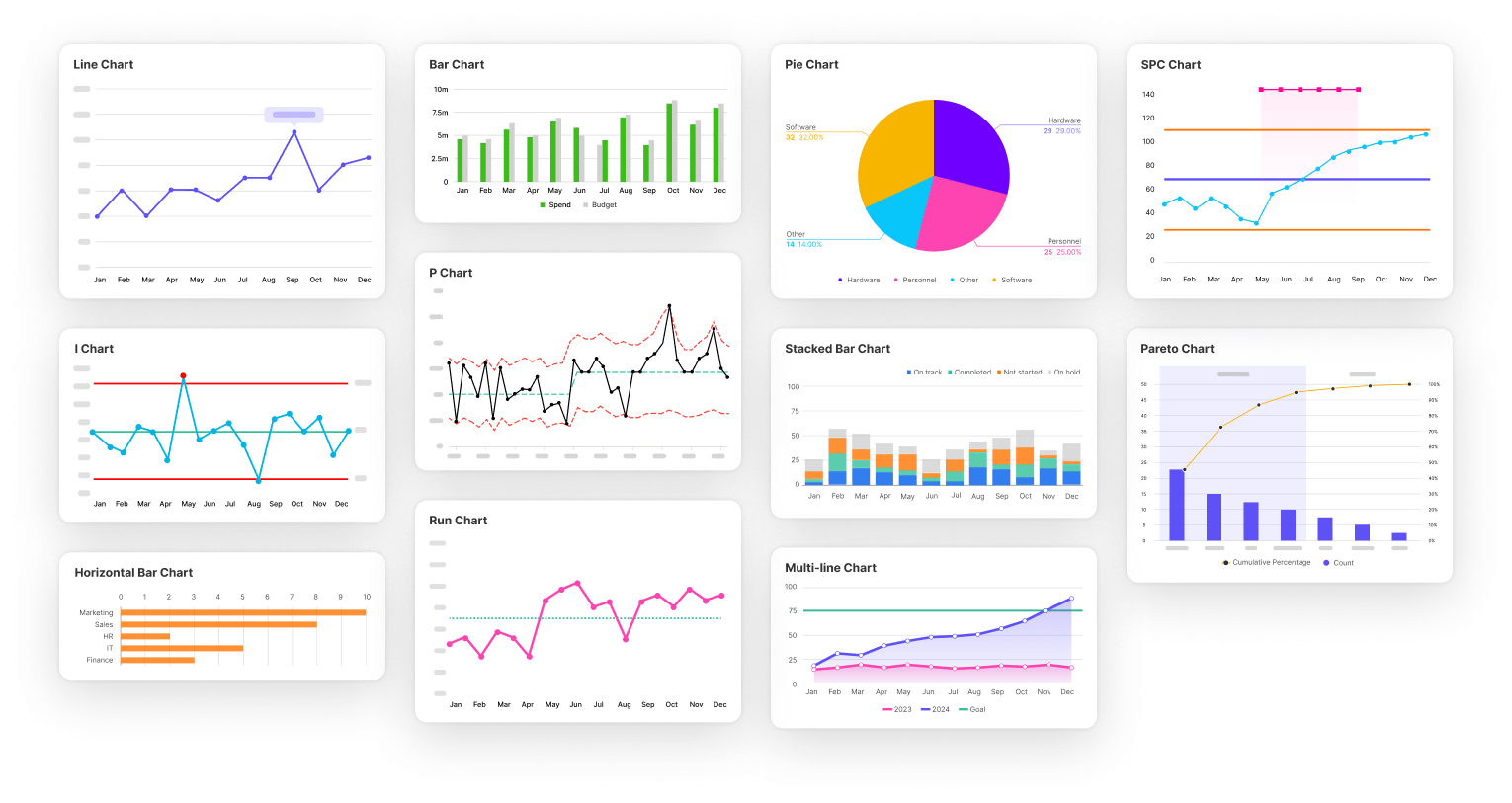
And if that wasn’t enough, we have also added new chart types as well. Simana offers all the charts you had in Life QI as well as:
- Run % charts
- Bar charts
- Line charts
- Pie charts
- Pareto charts
- Histograms
- Scatterplots
And there will be more to come – just let us know which chart type to add next!
The new charting capabilities in Simana represent far more than a visual refresh. They are designed to make improvement data easier to understand, easier to present, and easier to act upon.
From frontline teams tracking day-to-day changes, to improvement leaders overseeing organisation-wide programmes, Simana’s upgraded charts provide the flexibility, clarity, and analytical power needed to support modern improvement work.
And this is only the beginning.
We will continue expanding and refining Simana’s charting and analytics capabilities over time, with further enhancements already in development. Be sure to check back soon on the blog for more updates as we continue unveiling the next generation of healthcare improvement software.
